
Zara Redesign
Usability testing, evaluation and redesign of Zara website
Overview
Context
Masters project • Duration: 7 weeks • 2020
Deliverables
Usability Report • Prototype of redesign
Role
Team of 4 UX Designers.
Shared responsibilities: Usability testing on original website.
My responsibilities: Analysis, Individual report, UI redesign and A/B testing.
The Problem
Despite being one of the biggest fashion retailers in the world, Zara’s online retail underperforms against the competition with users being unsatisfied with the online shopping experience.
Original Zara Homepage
Usability Evaluation
Top Task Analysis
As large websites have hundreds of possible tasks a user could carry out, it was important to focus time and resources on the tasks that were most important to the user. A group of students were surveyed on most important tasks when using clothing retail websites. After voting, the results gave a clear priority list of tasks:
Top Tasks
(1st quartile)
Delivery
Sizing information
Product images
Medium Tasks
(2nd quartile)
Product Description
Customer Reviews
Filtering
Returns
User Scenario
A user scenario of a customer browsing for a new coat was devised that included all these Top Tasks and Medium Tasks. This scenario insured that testing was consistent and relevant to the user’s needs.
Usability Testing
A detailed usability assessment was carried out using different techniques:
Heuristic Evaluation based on the methodology of Nielsen and Molich.
Performance Evaluation comparing Task Time, Task Success, Errors and Lostness.
Satisfaction was measured and compared using the System Usability Scale (SUS).
Think Alouds and Thematic Analysis.
Eye Tracking Analysis.
Psychological Design Evaluation.
Accessibility Evaluation using WCAG 2.1 Guidelines.
Card Sorting to evaluate optimum navigation.
Original Zara Category Page
Original Zara Product Page
Key Findings
Whilst there were many positive findings from the evaluation there were a multitude of usability issues identified. Key findings included:
A lack of design hierarchy, hover feedback and a monochromatic colour scheme was causing difficulty navigating, differentiating important elements on the page and scanning information.
Excessively large images were causing user annoyance because of too much scrolling and not being able to see images in context.
Important information related to the Top Tasks such as delivery and returns were difficult to find and hard to understand.
Customer Reviews were not present, undermining the user’s trust.
Recently Viewed Items were not present to assist navigation and browsing.
Text was often difficult to read due to small size or being on top of images without adequate contrast.
Primary Navigation was hidden in burger menu and was difficult to scan and understand.
Auto-play videos and flashing images present without obvious way of disabling or pausing.
Misleading labels and missing page headers.
Filter menu is unnoticed and unused by users.
Categorisation of usability findings and solutions
Prototyping
Utilising these findings, a wireframe prototype was created and iterated around the user scenario. An After Scenario Questionnaire (ASQ) and an Expectation Measure test were used during development to inform the process.

Basic wireframe showing Home, Category page, Refined Category page, Product page, and overlays for utilities and menus.
Outcome


Redesign
Home page
The Home page in the Zara Redesign has been given a clear grid structure below the hero image and concise, descriptive labels have been added to aid navigation. While retaining a similar aesthetic to the original, the new design has a clearer hierarchy and utilises dark translucent boxes to ensure readability on images.
A red highlight colour has been introduced to facilitate quicker scanning and understanding of pages. Graphical feedback has been added when hovering over links; this speeds up user journeys and reduces cognitive load.
A consistent navigation bar, with an opaque background has been introduced to the top of the site. This bar is locked and in a consistent position throughout the site, ensuring easy navigation and minimising Lostness. The Search bar has been made more prominent to encourage quicker searching. As delivery information was our most prioritised Top Task, it has been given a consistent button within the navigation bar. This button brings up an overlay displaying delivery and returns information in an easy to understand form, from anywhere on the site.
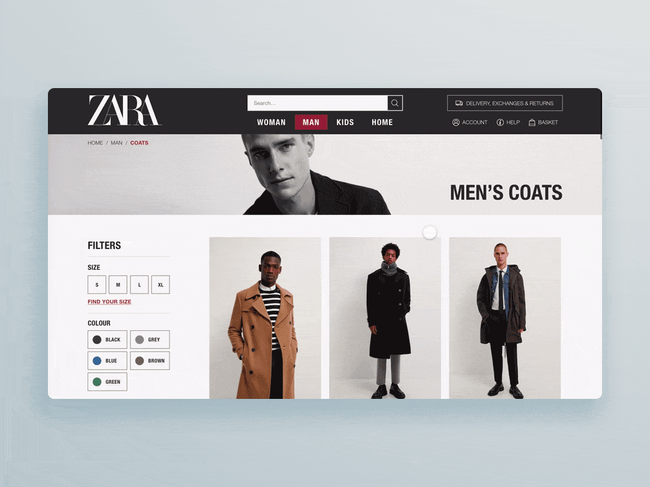
Category page
On the category page, usability issues have been addressed by introducing a clear header to the page and a structured, consistent layout to the items. Image size has been reduced to facilitate comfortable scrolling and browsing. The filter menu has been made immediately prominent with clearly defined options, utilising Dual-Coding for quick scanning.
A link to a Sizing information overlay (another Top Task) has been introduced to the filter menu so the user can clarify which size they are before selecting.
Zara Redesign Category page
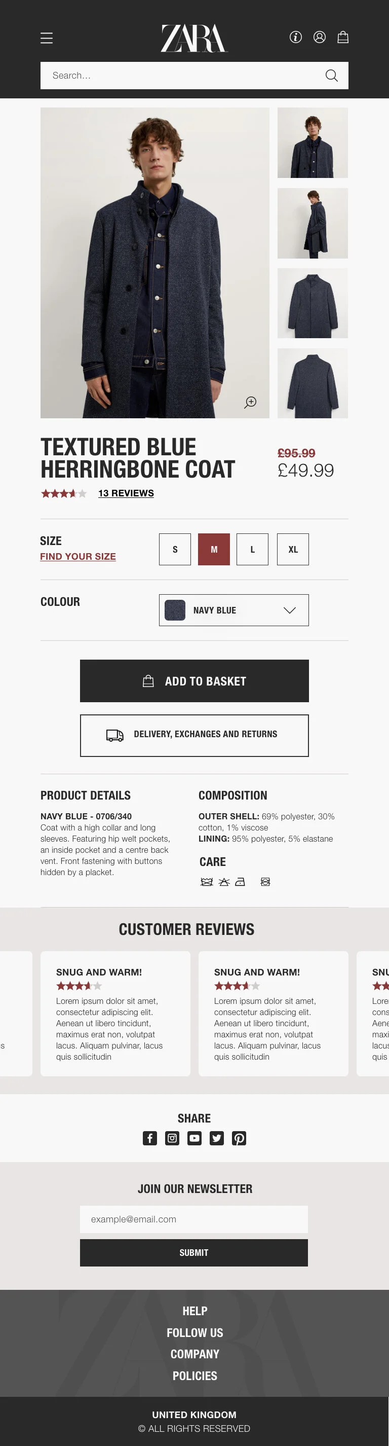
Product page
The product page has been redesigned to facilitate quicker scanning and understanding for the user. The images have been reduced in size so they are less overwhelming but have been given a lightbox feature to view the images in detail.
Customer Reviews (one of the missing Top Tasks) have been added below the product description.
Recently Viewed Items have been added to aid smoother navigation and browsing.
Zara Redesign Product Page
Responsive design
The Zara Redesign was created using a 12 column grid to facilitate easy scaling down to different screen sizes for different devices.


Tablet Home page

Tablet Category page
Tablet Product page

Mobile Home page

Mobile Category page

Mobile Product page
A/B Testing
The redesigned website was compared to the original through A/B testing. A Performance Evaluation, Satisfaction Evaluation and a Think Aloud were carried out on the new design and measured against the original.
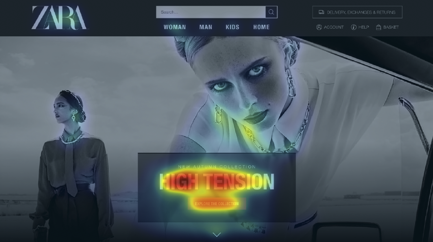
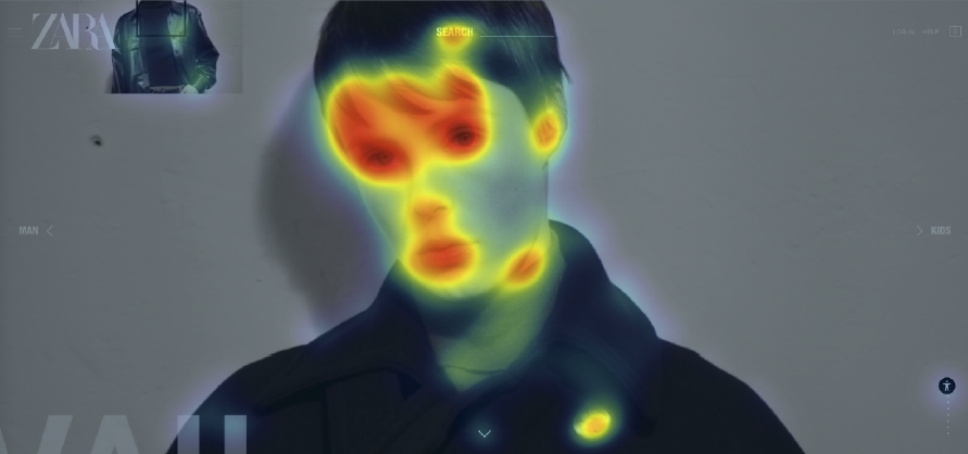
Both designs were also analysed using Eyequant, an AI powered tool for simulating user attention on a screen.
Redesign Home page

Redesign Category page

Redesign Product page
Original Home page

Original Category page

Original Product page
Conclusion
The Zara Redesign out-performed the original in the A/B Testing. There was highly positive feedback from users in the Think Aloud with many users expressing how easy it was to understand and find elements. The Satisfaction Evaluation gave an increased average SUS score of 90 (original was 67), comfortably over the ‘Acceptable’ mark of 70.
The redesign can be considered a success; it addresses the key usability issues and gained better metrics and user feedback than the original.
Reflection
The redesign was executed well, drawing on the conclusions of the usability evaluation. This project underlined the importance of accessible UX; designing for all as a minimum, not an add on.